1. This is my first design idea for my production company logo. I based this idea on a fairly simplistic design concept, focusing mainly on text, with the exception of perhaps changing one or two of the letters, much like the logo for film production company Pixar, featuring the lamp as the letter 'I'. In my opinion, this first logo design may be fairly appealing, but looks too 'childish' or 'kid friendly', which would therefore not fit in with the target audience for my films, which are aimed predominantly at 17-35 year olds.
2. For this design, I drew a regular screw, with the company's name 'Loose Screw' running down the sides of it. I think this logo is fairly simplistic, however quite effective. It emphasises the fact that there is a lone screw, perhaps 'loose' as the name implies. Despite this, however, it is not quite the design I am looking for, as this appears too simplistic.

3. This design utilises the same concept as design number 2, showing a screw somewhere within the logo to coincide with the name. Because of the fact I felt the second design was a bit too simplistic for my liking, I modified the screw to take on a more warped look, further emphasising this 'Loose Screw' idea. Despite this, however, I feel as if the lightning bolt shape does not reflect the full concept of the 'warped' and 'crazy' theme of the company and films it produces, with a lightning bolt perhaps signifying strength/power instead. Despite this flaw, however, I feel that this is quite a strong contender for the final version of my production company logo.

4. For my fourth design, I decided to go back and attempt an even simpler version of design number one, by making the text slimmer and removing the finer details of the eyes such as eyelids and eyelashes. This does reflect the simplistic and slightly 'warped' theme that I am going for with my logo, but I feel that the simple logos simply are not working, and do not appear to stand out compared to the more detailed ones.
5. For my fifth logo design, I decided to utilise the detailed eye image from my first design, and attempt to create a logo using that. The result is a fairly interesting logo, however the logo does not appeal to me. Perhaps the font is too thin, or perhaps the eye seems out of place - either way, this logo does not appeal to me, and therefore I will not be developing it any further.

6. For my sixth logo design, I got the idea of a brain showing a large amount of screws inside of it, with one screw in particular appearing to come out of the brain, emphasising this 'Loose Screw' concept, with the brain helping to emphasise this theme of 'madness' which I plan to channel through the psychological horror movie which I will be creating a trailer for. Despite all of this, however, the logo is far too complicated. In my opinion, developed and sized down, this logo would not look very good on something such as a poster where the production company logo would be quite small and hard to read anyway. I will aim to use one of the more simplistic logos, however, as discussed, not one that would come across as too simplistic.
In the end, I decided to further develop my third logo, as it was fairly simplistic, however also not too simplistic so that it looks child-like or unprofessional. The one main bad point which I picked up on with this was the fact that the lightning bolt design of the original logo did not fit in with the 'madness' theme I was aiming for. To rectify this, I decided to modify the shape into a spiral, trying to create a 3D effect my making the screw bend behind itself. Upon trying this, I realised I could make the spiral/warped point of the screw a letter 'O', and modified the rest of my logo around this concept.

This logo was made using Adobe Flash. I picked out the key points of the first logo by making a letter an object (e.g. the Pixar logo changing the letter 'I' into a lamp) and the third logo by not making it too simple but simple enough to be effective. I used Arial Black text as the font, a thick text, but also a simple, sans-serif text. The only thing I would change about the logo would perhaps be the colour, with the top and middle screw colours being slightly too dark.
In this second version, I have modified the colours slightly to a lighter set of colours for the screw. In my opinion, this looks marginally better than the previous one, giving a more interesting look to the logo. As well as this, these lighter colours would work well against the dark background of the horror poster. This will most likely be the version that I use in my products such as movie trailer, poster and possibly the magazine front cover.
I decided to create a square version of my logo. By creating this square version, I will be able to upload a version of my logo to social media sites that require a perfectly square avatar such as Twitter or YouTube.
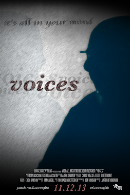
 Regarding my current auxiliary task (the horror movie poster), I believe that I am almost done with regards to the final poster. I have reorganised the layout and structure to a design that I think is far more simplistic than my previous designs, however is, in my opinion, far more effective.


