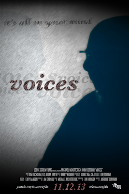
 Regarding my current auxiliary task (the horror movie poster), I believe that I am almost done with regards to the final poster. I have reorganised the layout and structure to a design that I think is far more simplistic than my previous designs, however is, in my opinion, far more effective.
I have removed the use of reviews and quotes from the poster. While these were effective, I felt that they did not help with the simplistic and refined design I was aiming for. They added too much text to the image for my liking, and created a cluttered and cramped effect on a poster that would benefit from a lack of objects rather than an abundance of objects.
To improve, I think I am happy with the design and layout, however the picture used for the background could be improved in terms of quality and clarity. The facial expression of the subject in the image is not immediately obvious. To rectify this, I will retake the image to a better standard of quality, ensuring to use a bright enough light source to emphasise the expression of the subject.
No comments:
Post a Comment