This logo is very simplistic, featuring the name of the film company but also modifying it slightly to make it unique to them. For example, the two letter Os in the word 'Room' have been modified so that one has a thinner circumference than the rest of the text, and one has been modified so that it is entirely filled in. These two circles have then been overlapped. This is a very simplistic design, yet it highlights the name of the company: Dark Room, with one circle being noticeably dark, and one being very light, contrasting the dark shape against the light one. I would like to use this concept within my logo, featuring one image which could be incorporated into the text, while still giving an insight into the nature of my production company.
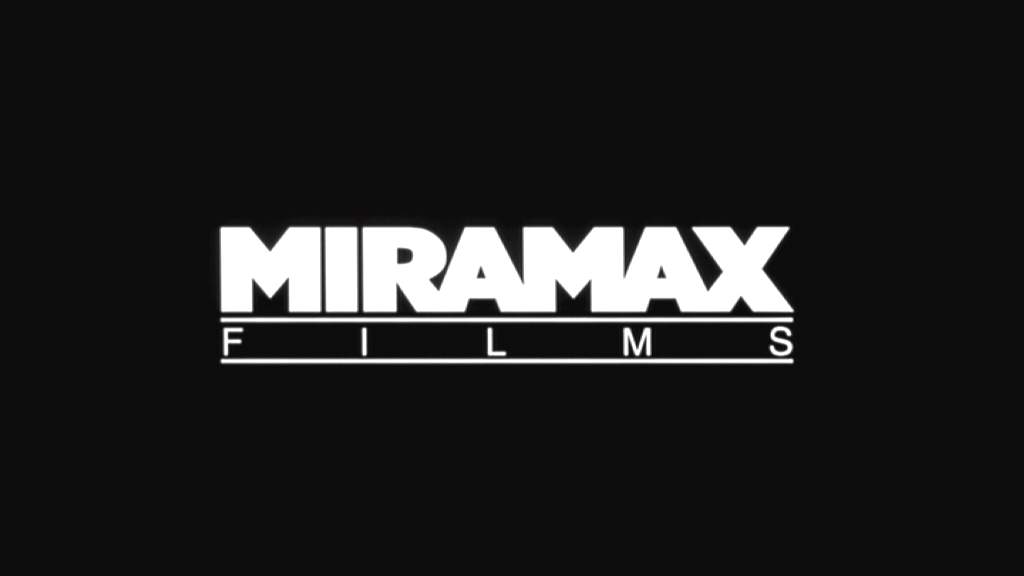
This logo adopts a far more simplistic design, not featuring any unique feature, and is far more traditional in the way it looks. One thing which can be drawn from this logo is the fact that they have chosen to use the company name 'Miramax' in an entirely capitalised form, also being rather bold and large compared to the clearly subordinate 'Films' present underneath. I like this concept, and will perhaps utilise this concept of making one part larger and then perhaps making the 'films' or 'productions' part of my logo far smaller in comparison.
Finally, this logo is from the British company Working Title, and is very simplistic, but still utilises a special feature to make it unique and stand out. The circle which gradually becomes lighter/more transparent as it goes on is the special feature in this instance, but still does not detract from the effective simplistic look of the overall logo design. I would very much like to use a simple font, as all three of these logos have utilised a very bold, sans-serif font, aiding them in their simplicity, as well as a unique feature to the logo to help make it independent.

No comments:
Post a Comment