Saturday, 10 May 2014

Deconstruction of Film Trailers

You're Next
To get a better understanding of how to construct a horror film trailer based on key conventions, I will be taking a look at 3 existing horror film trailers. The first one I decided to analyse is You're Next. One of the key things which I noticed was the large transition between two halves of the horror trailer. The beginning section (or first half) appears to be in a normal, calm tone, with the story progressing in the way a film trailer for any other type of film would. But a point arises within the trailer where this changes, and the music, lighting and pace all vary drastically to emphasise this shift in the storyline and highlight all of the tense, scary or unnerving moments. Another key element I noticed was the lack of a narrator, focusing instead on the characters on-screen to tell the story, as well as text appearing on-screen. This text that appears on-screen is another key convention present within the trailer, accompanied by silences/eerie music to make the audience think for themselves and let them formulate their own ideas or thoughts. The final major convention I picked up on was the large flashing montage of footage that appeared near the end, showing various short clips of the character(s) perhaps in danger, summarising the overall film into short, shocking jump cuts that the viewer struggles to absorb. This is the desired intention, as it leaves the audience confused and slightly unnerved.

The Conjuring
The next trailer which I decided to take a look at is for the 2013 horror film 'The Conjuring'. This film has a lot of similarities to the trailer for 'You're Next', the previous trailer. Once again, it adopts this 'narrative' style to the trailer, where there appears to be two 'halves' to the trailer, although in this trailer, they are far less even, with the 'calm' part to the trailer lasting for a far shorter time period than during 'You're Next'. This lets me know that perhaps as long as the emphasis is still there on the fact that there are two 'halves' to the trailer, then perhaps the length of each is not as important - personally, however, I do not like the fact that the 'calm' element of this trailer is short in comparison to the last trailer. The sound effects and music, once again, were a contributing factor to the horror within the trailer, indicating that I must take great care and not simply overlook the sound elements in favour of the visual ones, as both are equally important.

The Babadook
For my final trailer, I decided to watch the trailer for the 2014 horror film 'The Babadook'. Once again, the main thing which I picked up on was the similarities to the previous two trailers - especially due to the use of the 'two part' structure once again, setting up the storyline at the very beginning of the trailer before a 'shift' occurs and the characters become aware of the horror aspect of their surroundings. The trailer makes use of a very dark environment, featuring lighting that would appeal greatly to an audience familiar with the genre, noting that a dark environment is a key convention of a horror film. In my film trailer, I will try and recreate this dark and very ambiguous environment through the use of lighting effects, music and audio effects as well as through the use of dialogue and character movement.

Tuesday, 6 May 2014

Company Logo Research

This logo is very simplistic, featuring the name of the film company but also modifying it slightly to make it unique to them. For example, the two letter Os in the word 'Room' have been modified so that one has a thinner circumference than the rest of the text, and one has been modified so that it is entirely filled in. These two circles have then been overlapped. This is a very simplistic design, yet it highlights the name of the company: Dark Room, with one circle being noticeably dark, and one being very light, contrasting the dark shape against the light one. I would like to use this concept within my logo, featuring one image which could be incorporated into the text, while still giving an insight into the nature of my production company.

This logo adopts a far more simplistic design, not featuring any unique feature, and is far more traditional in the way it looks. One thing which can be drawn from this logo is the fact that they have chosen to use the company name 'Miramax' in an entirely capitalised form, also being rather bold and large compared to the clearly subordinate 'Films' present underneath. I like this concept, and will perhaps utilise this concept of making one part larger and then perhaps making the 'films' or 'productions' part of my logo far smaller in comparison.
Finally, this logo is from the British company Working Title, and is very simplistic, but still utilises a special feature to make it unique and stand out. The circle which gradually becomes lighter/more transparent as it goes on is the special feature in this instance, but still does not detract from the effective simplistic look of the overall logo design. I would very much like to use a simple font, as all three of these logos have utilised a very bold, sans-serif font, aiding them in their simplicity, as well as a unique feature to the logo to help make it independent.

Friday, 14 March 2014

Script Feedback and Subsequent Improvements

For the script which I produced for my film trailer, I received some basic feedback regarding it. Overall, it was generally well received, with comments citing how it followed basic conventions of a horror film trailer, specifically mentioning the divide within the script between the more relaxed opening and the more frantic ending as a key feature which will work well within my horror film trailer.

Regarding improvements to my script, it was suggested that the opening could be modified slightly, perhaps producing more of a build up rather than having the character immediately appear to the audience. In addition, it was suggested that the card that was written out for Alex was to be shown being sealed inside an envelope. This would make sense, given that cards are traditionally given sealed inside an envelope, but also eliminates the problem of the audience not knowing what the card said.

To rectify the improvements I have decided to still keep the very opening the same, regarding the exterior shot of the street, as well as the transition. Instead of the character walking around the corner to the garden gate, I have decided to include a small sequence prior to this showing the character reversing into the street in a car, followed by an interior shot of the car showing the character writing out the card which he plans to deliver to Alex before sealing it inside an envelope. He then steps out of the car and walks towards the gate and the rest of the scene continues as normal, the only difference being that he now has a sealed card instead of a one which was not, a minor detail but far more realistic.

Here is how the modified script now looks:

FADE IN - TRANSITION
 
 
EXT. STREET - EARLY NIGHT/LATE EVENING
 
 
A vehicle enters the frame and is seen reversing into an empty street, coming to a stop outside a house.
 
 
INT. CAR
 
 
DAVE, a 50 something, fairly tough looking man, is writing a card out to congratulate Alex, his son, on moving into his new home. He seals the envelope before stepping out of the car. He walks through a garden gate and knocks on the front door of a regular looking house. In one hand, he is seen holding the envelope. He awaits a response, placing his unoccupied hand in one pocket. After waiting for a few seconds, he knocks again. 
 
 
DAVE (gesturing to an upstairs window)
Alex?

He knocks again. He tries the handle. To his surprise, it's unlocked.

DAVE
Oh...

He enters cautiously, closing the door behind him.

INT. HOUSE - LIGHTS ARE OFF

DAVE (now slightly annoyed)
Why are the lights off?

He turns the lights on, steps into the house and looks around.

INT. LIVING ROOM

DAVE
Alex? Where are you, son? You said you were in.

Distant, eerie voices can be heard, which Dave notices.


DAVE
You know if you'd told me you had people over I wouldn't have came, I would have just came back later, it was only to drop off...

As Dave is talking, he walks towards the front door and tries to leave, only to realise the door is now locked. He stops talking once he realises this. He stares at the door handle for a while.

The lights switch off, despite the light switch clearly being in shot with no interaction. Dave stares at the light switch momentarily, confused.

Dave drops the card on the floor.

DAVE (puzzled and slightly worried)
What the...?

Mid-shot of Dave pulling a mobile phone out of his pocket. Extreme-close up of text 'No Service' on mobile phone.

The shot switches to handheld, similar to the found footage style of film. Dave is filming himself.

DAVE
There's someone or something else in this house with me, I know there is, I can hear them

The shot changes to more handheld footage while Dave is talking.

DAVE
I don't know what on Earth I've got myself into, but whoever you are... you'd better show yourself now.

Dave hears a loud thump from upstairs, pauses for a few seconds, and starts walking upstairs to investigate.

Voices can be heard whispering. Dave freezes as he hears these whispers.


DAVE
Right... I'll give you to the count of three... One... Two... Three...


INT. SHOT OF ROOM

Close up of Dave's face with worried eyes.

DAVE (melanchollically)
I just wanna get out, I just wanna leave, I don't like this anymore

In the background of the shot, a dark, cloaked figure can be seen appearing at the window. They knock on the window. Dave's eyes immediately open wide.

EXT HOUSE. EVENING/NIGHT

ECU of door handle. Zoom out to Wide Shot.

FADE OUT - TRANSITION

Tuesday, 11 March 2014

Editing Choices

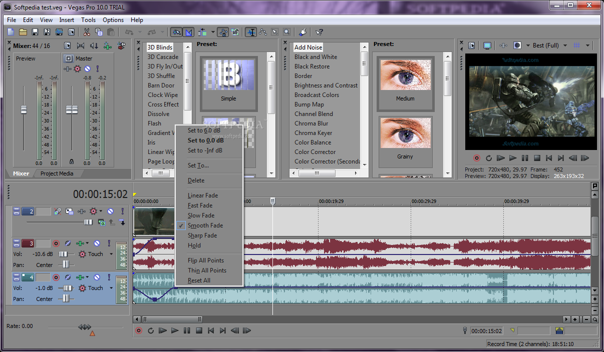
When editing my film, I will be using Sony Vegas Pro, a piece of software I am very comfortable with using, as well as one that I am confident will be able to handle all of the effects, transitions and layers that I wish to include within my film trailer.

An example of a product being edited within Sony Vegas 10.0
Regarding the ancillary tasks, I have opted to use Adobe Photoshop to create, edit and modify the poster and magazine cover. Both of these pieces of software are very easy to use as well as offering the user the ability to create high-quality, professional products.

Combined, I believe that both of these pieces will allow me to create all of my products to a professional level, as well as allow me great flexibility while using them.

Sourcing Costumes and Props

With regards to costumes used within the film, I have opted out for any specific clothing choices, and simply stated that the actor should appear wearing relatively normal clothing as well as a coat because of the cold weather. There may also be a chance of rain during the external part of filming. While this may help the overall look of the film, it is by no means necessary to the storyline and/or production of the film itself.

The only props that are required throughout the whole trailer are a card and a mobile phone. Regarding the card, I went out and purchased one after searching through several different cards to see which one worked best. One of the things I took into consideration when making this choice was the visibility of the text on the card to make it obvious to the audience exactly what the card was for. I believe my final choice matched this criteria perfectly. As for the mobile phone, I decided upon a regular modern phone, continuing with the idea that, for the most part, the film should remain as 'regular' as possible, focusing on the character's emotions and development to generate most of the 'horror' within the trailer.

Contacting Actor(s)

Relating to the actor who I wish to play the main role within my film/trailer, I have contacted them verbally and they have agreed to take part in the film. We have also arranged a specific date and time for which the film will be shot, the costumes etc. and, once again, this has been mutually agreed to.

Monday, 10 March 2014

Photoshoot/Filming Plan

1. What emotional impact do you want your photography do have upon the reader? How?
The photographs displayed within the tasks should provoke a reaction from the audience that matches the overall emotional impact they should receive from the final film trailer. By placing the subject of these photographs in a suspenseful, depressed or worried expression then hopefully this will help convey the emotion and theme of the film through to the audience. By implementing a similar expression in the photographs for both tasks, as well as through the shots in the film trailer, this will help create a sense of cohesion between the three pieces. I want the reader to feel as if they can empathise with the main subject of the images, perhaps connecting with the sense of isolation and desperation that the character is feeling in the photographs. I will achieve this by portraying the character with a desperate expression, making it immediately obvious they are in need of assistance.

2. Who are you going to photograph/film?
For both photoshoots (for the two print tasks and the film trailer) I have a clear idea of who I want to use. I will be using my father as the main character who will be therefore appearing in all three tasks, as I believe they are the perfect candidate for the desired effects I want to convey through the film and print tasks.

3. What props will you need?
There is a prop which is required for the filming of the film trailer, a greeting card. I have purchased two of these in preparation for the filming of the scene. Despite only requiring one, I have purchased two in the event that we decide to change a certain aspect of a scene after sealing the card, or in the event one of the cards/envelopes becomes damaged. Other than this, I do not believe I require any additional props for either photoshoot.

4. How are you going to emphasise colour?
Colour will be emphasised by filming the trailer at night, immediately setting the tone of the film as a dark and melancholy tone. There will be ambient lighting provided by nearby street lights which will ensure the trailer isn't filmed in complete darkness. For the interior shots, I will use regular lighting, but in a particular way to provoke certain emotions throughout the trailer. An example would be the beginning shots where the character is entering the house. These would, naturally, be fairly bright, as the character is still unaware of the dangers he is facing. As the trailer progresses, however, and he becomes more aware of these dangers, I will utilise far darker lighting effects to convey this empty and dark tone where required.

For the two ancillary tasks, I will be very careful to use appropriate colours, taking the necessary photographs in such a way that colour is clearly emphasised in the desired way. For the poster, I will aim to get a melancholy colour emphasising the character's distress and inner turmoil. Regarding the magazine cover, I aim to do the same, however to a lesser extent, as magazine's typically would not follow all of the conventions the poster or trailer do, as it is a separate text from either of the two others.

5. Have you briefed your personnel/photographer? 
I have briefed the actor that I will be using in my film trailer and, consequently, my two ancillary tasks, and have agreed that they are able to attend the photoshoot(s) on the desired dates.

6. What lighting will you need? Any other equipment?
As discussed previously, I will need no special lighting other than the lighting provided by the environment, as I wish for this trailer to look as natural as possible, helping the audience to connect with the storyline/main character by getting a vibe from the trailer indicating that it is very natural and not staged, adding to the credibility and believability of it.

As for the lighting of the ancillary tasks, I will be using certain lighting effects for the poster to create a silhouette effect on the main character, indicating that everything else apart from the main character is illuminated, once again linking to his state of emptiness and inner turmoil, the continuing theme throughout the three tasks and the film as a whole. The poster, however, will not use this effect, and any lighting I do decide to use will be applied to the subject's face, the prominent factor within a magazine cover, as previously discussed. If I were to use any artificial lighting, this would primarily be used to cover half of the subject's face, providing a sense of ambiguity. This effect can always be added during the construction stage at a later date, so it is perhaps not entirely required, or at least not completely compulsory.

7. Where will you shoot? Will you need a backdrop?
As discussed in my possible locations post, I will be filming in a house. This once again links to the fact that the trailer should look as natural as possible, and any use of 'abandoned warehouses' seem to resemble tropes or clichés rather than core conventions of a film trailer, coming across as too gimmicky and obvious for a psychological horror film such as this one. A regular location, such as a house, is far more believable and acceptable for a horror film such as this one.

For my ancillary tasks, I will be using a plain backdrop to give me the ability to manipulate the image far easier than if there was a background that was filled with lots of information and details. By avoiding a heavily detailed background, I will also be able to keep the focus of the image centred around the character and nothing else.

8. Make-up? Costume?
Mentioned above, I have stated how I wish for the trailer to look as realistic as possible. I wish for the audience to feel as if they can connect easily with the character, and therefore by removing any superficial elements such as make-up, costumes etc. then this can help to bring a sense of realism to the piece, helping the audience connect far more easily with the character than they otherwise would be able to.

The same principle applies for the ancillary tasks, as horror film magazines would not traditionally feature the subject wearing a piece of clothing such as a suit for example. Because of this, I will be ensuring that the subject looks as normal as possible, while still being able to direct their facial expressions and body language to achieve the desired effect and thus emphasise the overall theme of the film trailer and the corresponding advertisements.